Avito · B2C Delivery · 2022

Designing the experience
100k+ pro sellers chose

How research shaped the design and launch of a brand-new delivery type for professional sellers on Russia's largest marketplace Avito

Role
Senior Product Designer
Platform
Web
Year
2022
Collaboration
Product · Developers · Analysts · Legal · Support
01 — The Challenge

Why we built a new delivery type from scratch

Before this project, Avito only supported its own managed delivery (Avito Delivery). But a large portion of professional sellers — those dealing in bulky items like furniture, appliances, and equipment — were arranging their own logistics completely outside the platform. Avito had no visibility into these transactions and no way to support buyers if something went wrong.

We needed a new delivery type: DBS (Delivery by Seller) — a channel that lets sellers use their own couriers or carrier services while keeping the full transaction inside Avito.

An additional channel for selling non-Avito Delivery items
A needed feature for professional sellers whose goods couldn't be shipped through standard Avito Delivery.
An additional income stream for the company
By routing seller-arranged transactions through the platform, Avito could take a commission on deals that were previously invisible to it.
Ability to control and analyse DBS deals inside Avito
Before launch, all bulky-item deals were made outside the platform. Avito couldn't track them, support buyers, or intervene when something went wrong.
02 — Research & Insights

Testing the hypothesis before starting work

Before creating the wireframes, the product manager and I conducted a quantitative survey of 365 vendors across four segments: Private (A), MidMarket + Enterprise (B), MidMarket (C), and Enterprise (D). The goal was to confirm the hypothesis that the new delivery method would address user pain points.

And what we found:

B · MidMarket + Enterprise
0%

Setup complexity is the barrier

15% say delivery isn't relevant; 14% find it too inconvenient. Both signals point to a setup flow that fails to justify the effort for this segment.

C · MidMarket
0%

The goods don't ship

22% say buyers want to inspect items in person; 13% find delivery not applicable. Bulky or high-value goods where carrier delivery simply doesn't fit the transaction.

D · Enterprise
0%

Trust and format are twin blockers

13% cite fraud concerns; 15% say buyers prefer in-person. Enterprise sellers face both a trust deficit in the platform and goods that resist standard delivery.

Reason for not using delivery A Private
(Earning)
B MidMarket
+ Enterprise
C MidMarket D Enterprise Total
Not relevant / don't need / not applicable 14%15%13%10%14%
Too inconvenient / complicated / time-consuming 18%14%10%8%14%
Don't trust / fraud concerns 10%12%8%13%10%
Sell with upfront payment 7%8%6%8%7%
Buyer selects delivery service themselves 1%3%3%0%1%
Satisfied with current Avito delivery conditions 8%10%8%0%6%
No intermediary / different delivery method used 12%9%16%10%12%
Buyers prefer to see items in person / can't use carriers 13%6%22%15%13%
Selling personal items / small sales volume 3%6%1%3%3%
No opportunity to organise / need documentation 4%2%1%3%2%
Long wait for payment / possible holds or freezes 4%3%2%5%4%
Too expensive / not willing to pay for delivery 2%1%4%5%2%
Not profitable for buyer / buyer won't agree 2%1%4%5%2%
Unclear how to process order if buyer wants to add items 1%1%1%2%1%
Other 7%6%6%10%7%
Don't know / refused to answer 5%4%7%10%5%
BASE 36520016540365
Quantitative survey across 4 seller segments (n=365). Highlighted cells indicate statistically significant differences vs. other segments.
Good points
  • Pro sellers really need DBS as a new type of Avito Delivery to sell bulky items
  • DBS is especially important when selling to other Russian cities
Restrictions
  • A lot of pro sellers use a C2C profile and don't use a pro account Therefore we decided to implement DBS in the C2C profile
03 — Mapping the System

Designing the IA before designing any screens

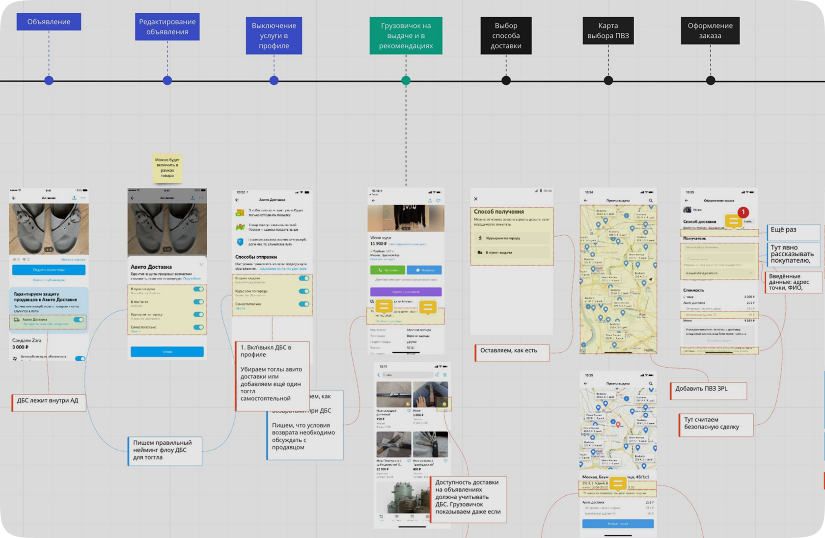
The delivery feature had 15+ distinct order states — from initial terms request through logistics review, multi-path cancellations, and timeout cascades. Before opening Figma, I mapped the full state machine to understand the entire scope of what the design had to communicate at every step.

Each state required a different UI treatment: a different status indicator, a different set of available actions, a different empty state, a different error pattern. Designing screens without this map would mean gaps that left sellers stranded mid-transaction.

CANCELLATIONS MAIN FLOW EXCEPTIONS Order Created Terms Requested Terms Accepted Awaiting Payment In Transit Delivered ✓ Completed cancel · pending cancel · confirmed cancel · performed cancel · delivered timeout · terms timeout · payment timeout · delivery logistics review dispute ↩ refunded
Main flow Terminal Cancellation path Timeout state Review & dispute Exception transition
The order state machine — 15+ states including cancellation cascades, timeout states, and a logistics review path. Each node represented a distinct UI design requirement.
Full state machine with UI mockups
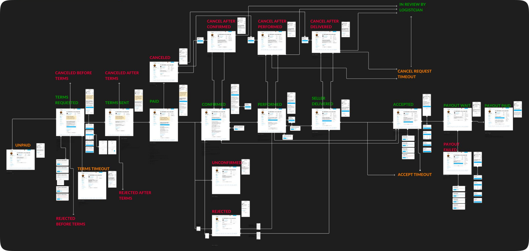
Full state map with UI mockups assigned to each state — used to verify design coverage across the entire transaction lifecycle and identify which states were sharing screen patterns they shouldn't.
04 — Customer Journey

Mapping the full buyer and seller flow

Beyond designing the IA for the new order statuses, the new delivery type also had to be integrated into the existing search, selection, and payment flow — for both buyers and sellers. To map this end-to-end, I ran a CJM workshop with the team and built a full journey map covering every touchpoint across both sides of the transaction.

Customer Journey Map for seller delivery experience
One slice of the full CJM
05 — Design Strategy

Three principles. Every screen decision traces back to one of them.

01

Hierarchy drives understanding

The visual structure of a screen should answer "what am I looking at and what matters most?" before the seller reads a single label.

02

Design for the segment at the moment of decision

Different seller types make decisions differently. The design had to surface the right information density for each group without creating any inconvenience.

03

Reveal complexity through interaction, not upfront

Every screen should have one primary task. Configuration complexity should only appear once the seller has signalled they need it.

06 — Design Iterations

Four versions. Here's why three were rejected.

Every design decision was tested against the principles and the research. Below are the four iterations of the delivery settings experience — with the specific reasoning behind each rejection and what the final version got right.

Before

Delivery buried in general account settings

Delivery settings lived inside the general account page — buried among security alerts and contact fields. No dedicated section, no visual hierarchy. Most sellers never found it, and those who did faced a flat list of unnamed toggles with no indication of what enabling each one actually committed them to.

Before: delivery settings inside general account page

Interfaces have been translated from Russian

V2

Dedicated delivery tab — discoverability fixed, comprehension unchanged

Delivery moved into its own tab, solving the findability problem. But the layout inside stayed flat — a list of carrier names with no explanation of what each meant for the seller's workflow. Sellers could now reach the section; they still couldn't make an informed decision once they got there.

V2: dedicated Avito Delivery tab with toggle list

Interfaces have been translated from Russian

V3

Card-based layout — first version that matched the seller's mental model

Toggles replaced by cards. Each delivery type became a distinct visual unit with a heading, a plain-language description of what it means in practice, and its own setup CTA. The layout now matched how sellers think about delivery — by method, not by carrier name. For the first time, sellers could scan and self-select without reading everything.

V3: card-based layout with delivery type descriptions

Interfaces have been translated from Russian

V4 — Final

Multi-step setup — complexity staged, not front-loaded

Setup redesigned as a sequential flow: choose regions first, then configure tariffs in context. The tariff table that had caused drop-off now appeared only after sellers confirmed their coverage area — making it relevant rather than overwhelming. Each screen had one decision and one action, which distributed the perceived complexity across smaller, manageable steps.

V4: multi-step courier setup with staged configuration

Interfaces have been translated from Russian

07 — Collaboration

How I aligned five teams without losing the design logic

A feature touching logistics partners, legal, support, product, and engineering creates a lot of competing input. The risk in a project like this is design decisions that gradually shift to accommodate everyone's preferences rather than serve the user. Here's how I structured collaboration to keep it productive.

Product Team
Maintained a shared state coverage doc — a visual map of every order state with the corresponding screen linked. Gave product a live view of progress and gaps, making sprint planning concrete.
Research Team
Research ran as a parallel track, not a gate. I brought design questions to research sessions and fed findings back into decisions — that loop directly shaped the IA and the card layout.
Logistics Partners
Kept logistics partners in the loop throughout the process — sharing progress regularly to stay aligned and make sure the design matched their actual service capabilities.
Legal Team
Presented screens in context, not as static docs. Asked for specific change requests rather than general risk flags.
Customer Support
Provided the support team with full documentation on the new delivery type so they could handle incoming requests quickly and confidently from day one.
08 — Impact

Launch, an unexpected spike, a quick fix — and 100,000+ sellers.

After launch, metrics showed a jump in DBS activations among C2C users — which looked positive at first. But private sellers didn't understand how to handle delivery via carrier contracts and were cancelling orders. Our activation metric was climbing while the closed-deal metric was declining alongside it.

DBS connection growth chart Jun–Aug 2022

As a quick fix, I proposed disabling DBS visibility for C2C users entirely and keeping it only for pro sellers. Once private users were removed from the funnel, cancel rates dropped and we could track clean data on the segments that actually understood the product.

As a result: 100,000+ sellers in the first month, ~1,000 orders per day.

Seller growth after disabling DBS for C2C users
09 — Reflections

What I learned

  • Think twice before deciding. Despite the fact that everything turned out well, we should have been more critical of our ideas — for example, running research among private users earlier to understand if they were actually interested in DBS.
  • Metrics are power. Defining key metrics is necessary, but tracking the ones that could be indirectly affected by the launch is even more important.
  • Be brave. If you know how to improve the user experience — suggest the experiment. Don't wait for permission.